CoinFund



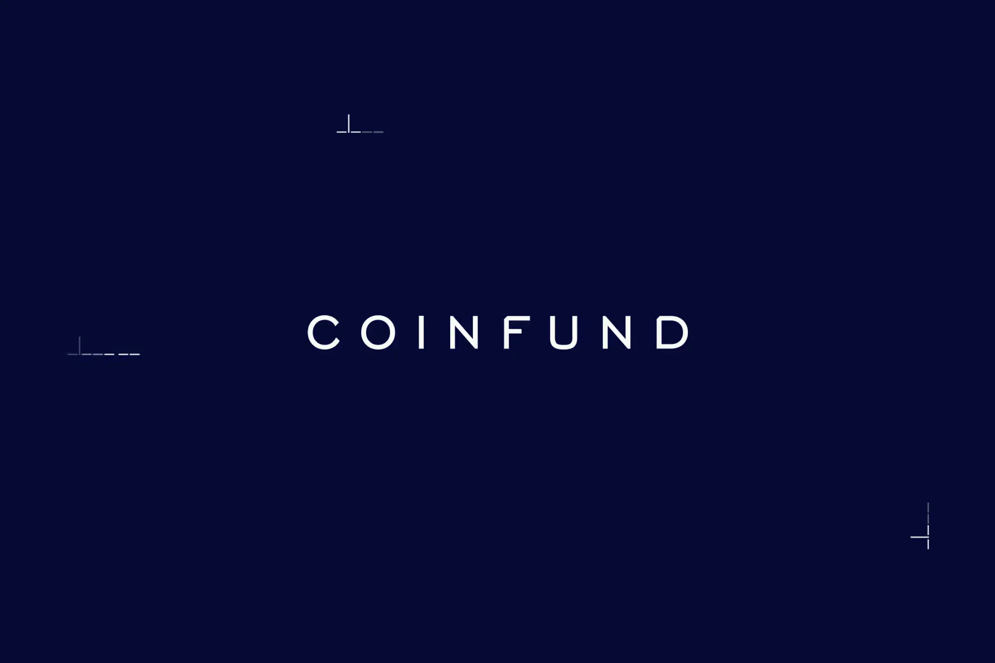
New brand launch for the NYC fund specialized in decentralized systems. The design is based on the idea of an encrypted binary alphabet that functions as a brand system: logo, typography, graphic elements and motion motifs. Every part of the brand now speaks tech knowledge without flaunting it, in pure iykyk aesthetics.
Details & Deliverables
Creative Direction
Art Direction
Brand Identity
Website Design
Interaction Design
Website Development
Custom Software Architecture
Client
CoinFund
Year
2026
Technologies
Reframing Decentralization
Bringing two worlds together: the timeless, institutional charm of New York City and the modern aesthetic of decentralized technology and finance.
Research
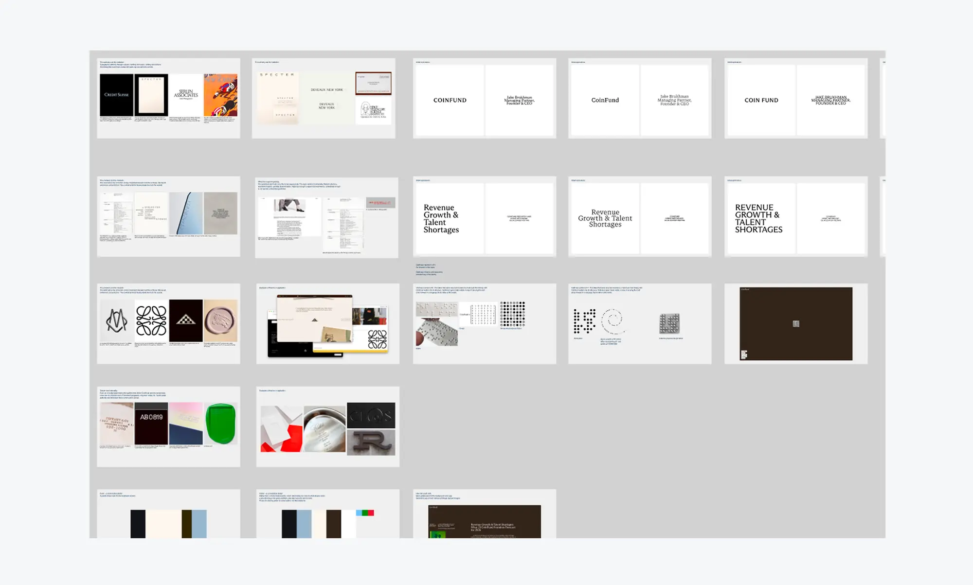
Our design process is grounded in thorough research: historical references and cultural contexts are carefully evaluated and mixed to spark innovation. Exploring New York’s rich heritage of symbolism opened up many avenues to create an original identity for CoinFund.
Idea & Testing
Ideas are generated throughout the exploration phase. Every idea is stress-tested in the context of deliverables. For CoinFund, we tested the binary motif with several typefaces, kerning combinations and in motion before we settled on one variant.
Results
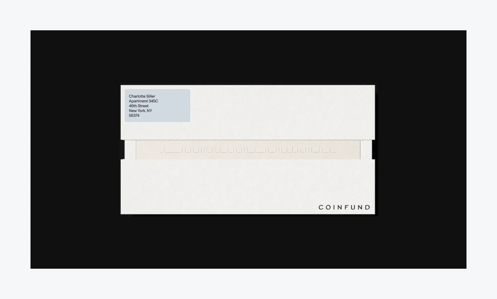
The result was a modular and scalable brand system that is authoritative yet visionary and future-oriented. The identity adapts seamlessly to any application, from print invite cards to a desktop or mobile screen.
Design notes
The website was designed to feel premium, institutional and high performance: all principles reflected in the fund’s ethos.
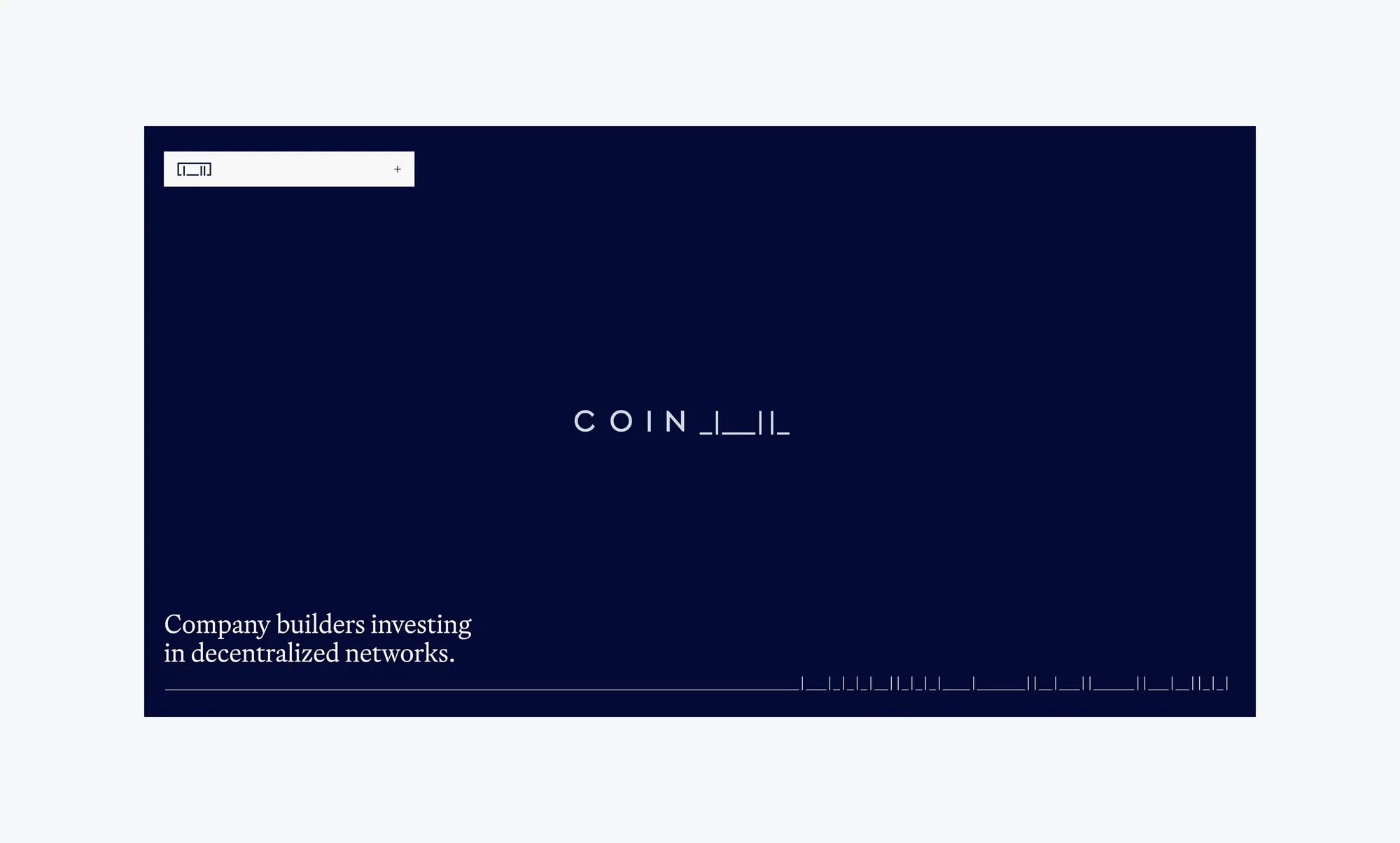
All elements follow a precise layout grid with intentional spacing and separators featuring the binary motif. To elevate the experience, we added subtle hover and entry animations swapping binary code for normal text.
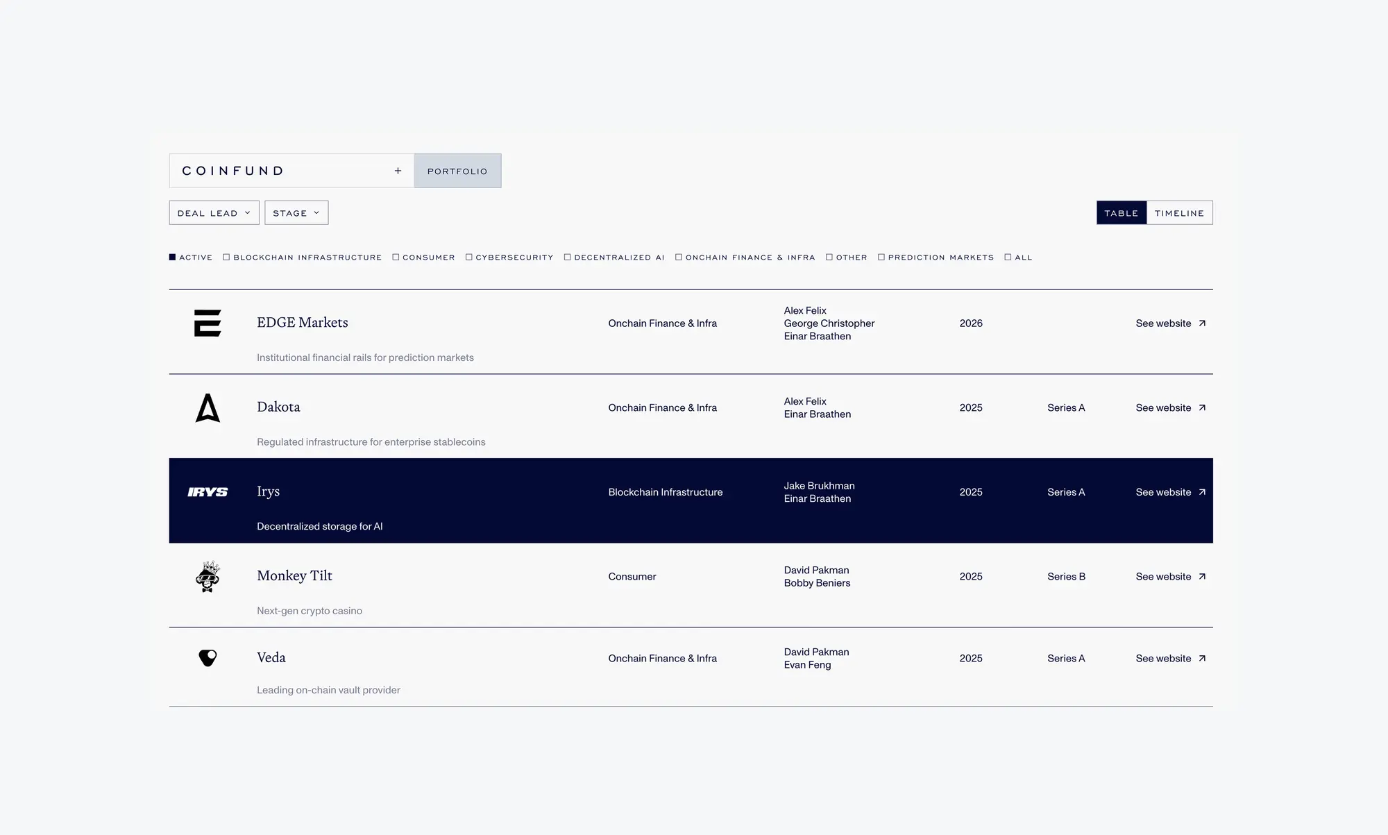

Stack: SvelteKit frontend, Sanity CMS, GSAP animations. Lighthouse score: 96, 97, 96, 100.