NeueHaus Identity



- Client
- NeueHaus, 2026
- Deliverables
- Creative Direction, Brand Identity, Website Design, Website Development, Motion System, Brand Toolkit, Brand Experience Design
- Collaborators
- Lena Pia Hammerstingl (NeueHaus) Creative Direction, Strategy, ContentTom Mussak (NeueHaus) Art Direction, Brand & Design
- Technologies
How the NeueHaus identity came to life from our early work and inspiration to the influences of working closely with our members.
A contemporary guild
We started NeueHaus about two years ago, in the midst of an economic downturn and the first AI scares, on the firm belief that the creative industry's best problem solvers lacked a platform and a real, curated professional network.
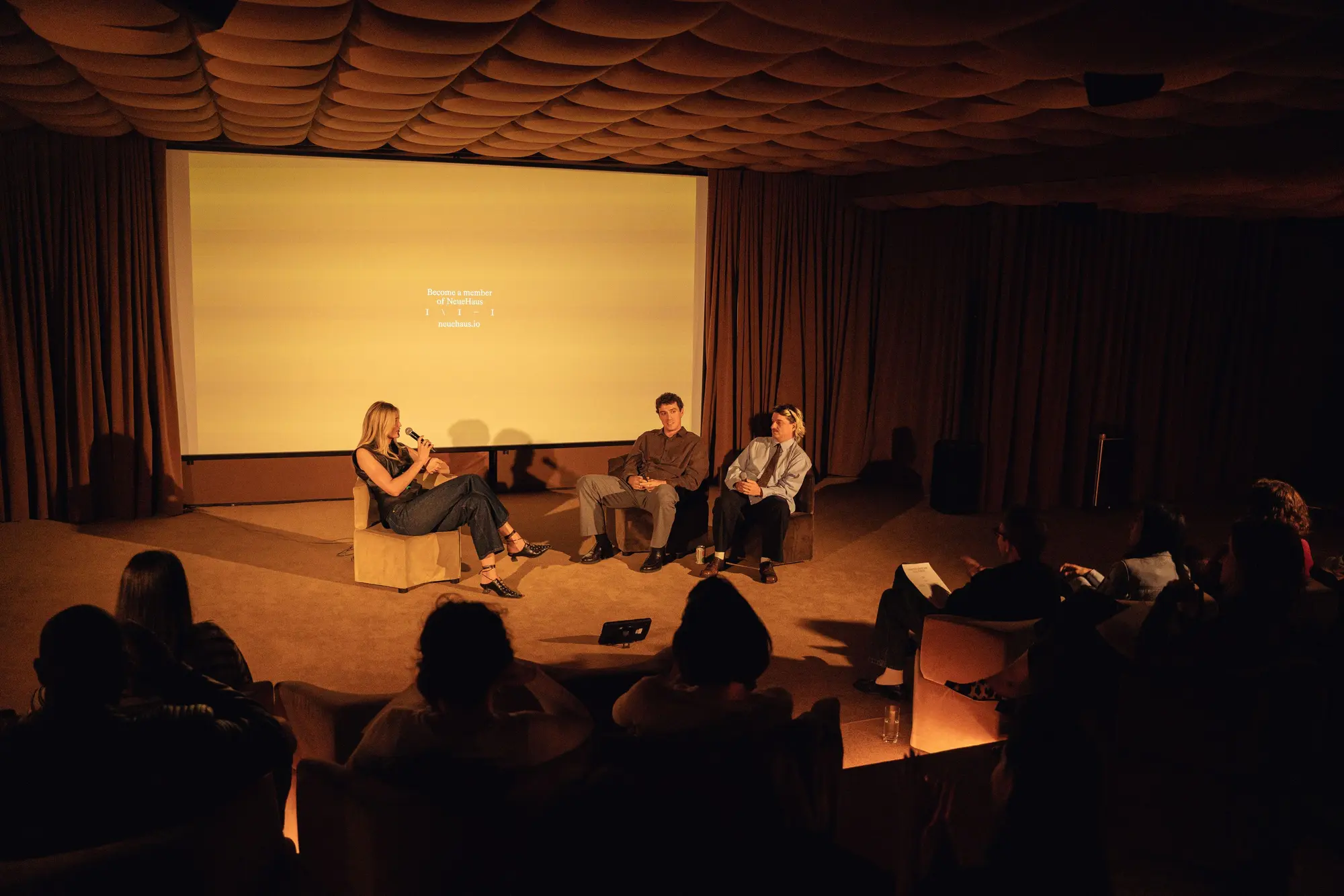
One of the anecdotes that we shared is about Mr Wolfe, the famous Pulp Fiction character who in my eyes has always been the embodiment of a freelancer: someone particularly good or effective at what they do that companies and individuals call to solve a specific problem.
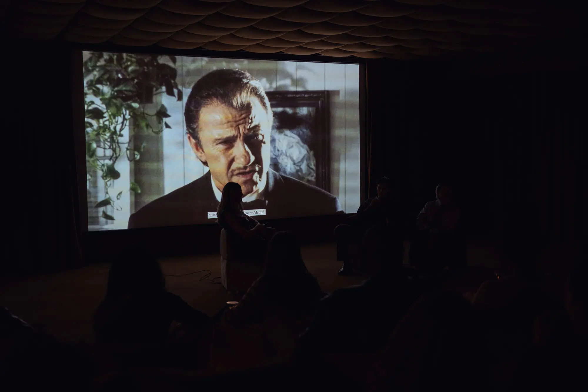
Now, whether you work for a company, an agency or independent, you most probably encountered at least once someone like him. We call them The Externals. Sometimes they are a whole team or agency, and sometimes they are loosely organized, independent freelancers who are exceptionally good at what they do. They come in, they solve the problem, and they move on.
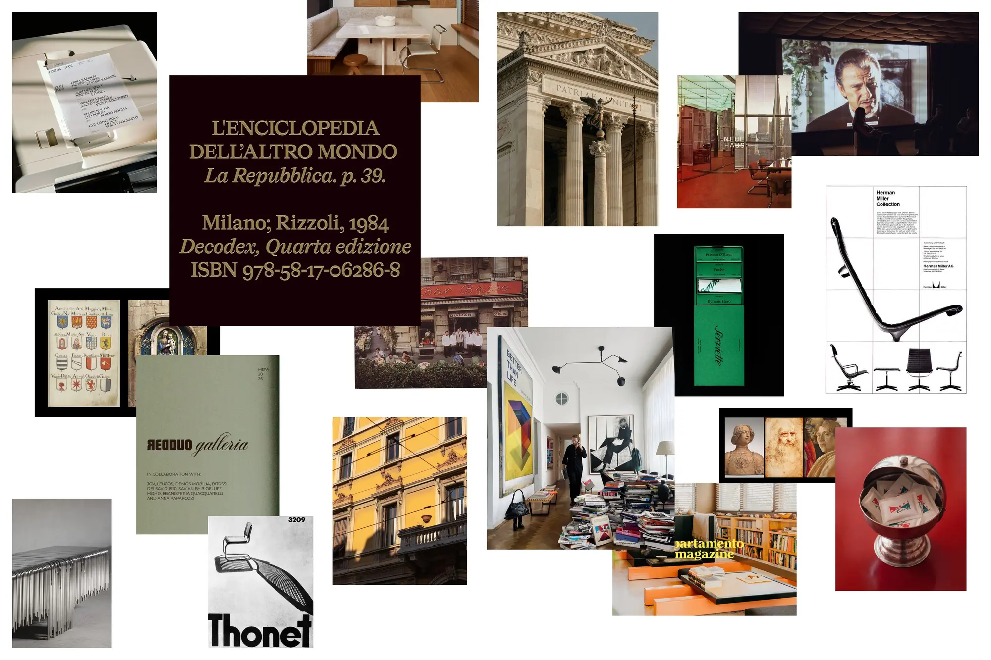
At the core of how we think and create is a specific work philosophy that connects us to the art guilds of Florence, and to the Bauhaus' typical blend of business and creative exploit. Both these institutions promoted concepts such as the inseparability of art and craft, cross-disciplinarity, abundance, entrepreneurial spirit and a space of professional support for nurturing talents.
Platform Identity
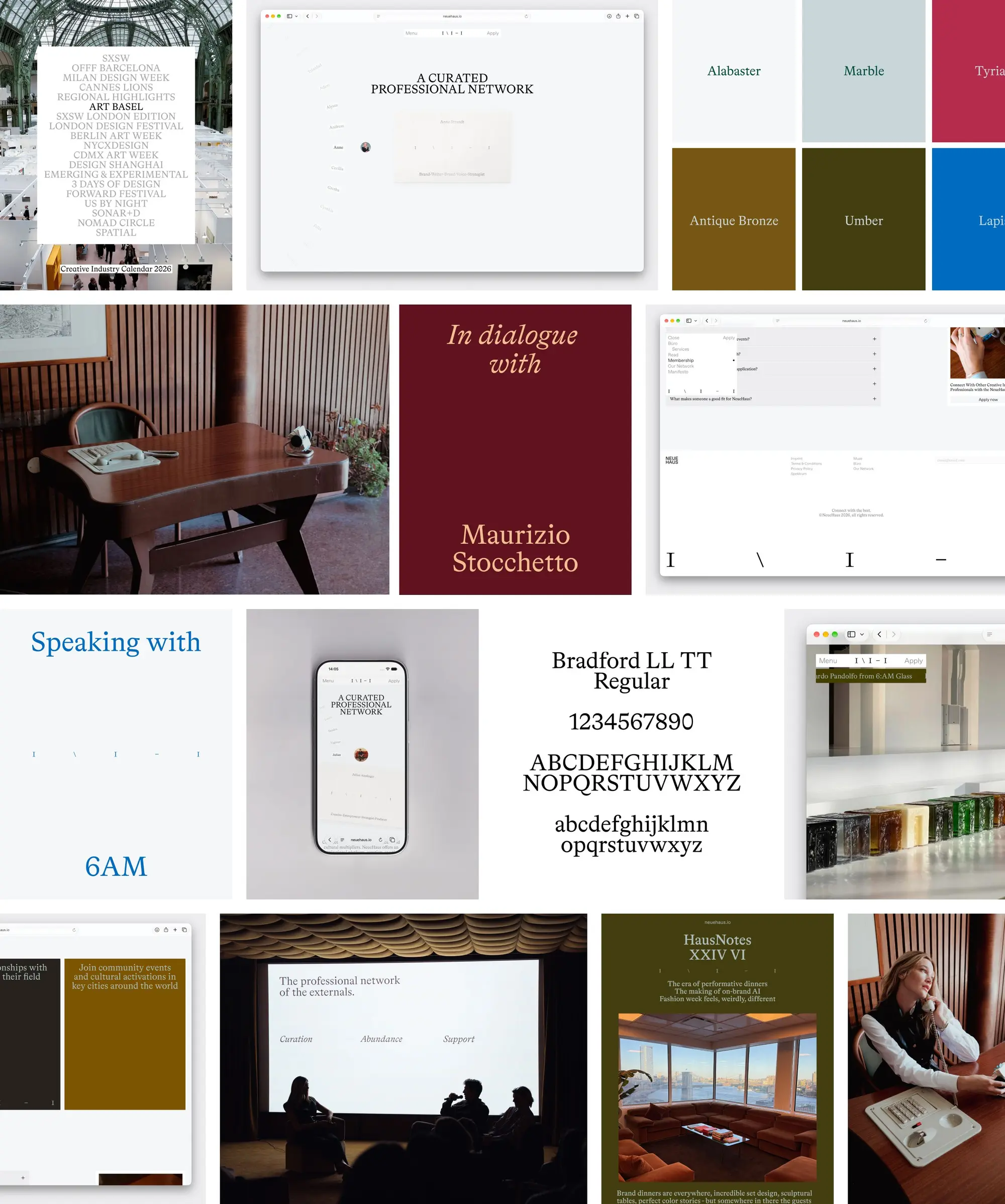
The core idea of the new NeueHaus brand is what we call platform identity: an identity that works as a toolkit rather than a uniform. It enables our members to shape it and use it to grow their individual brands and shops, much like a guild would allow artists to.
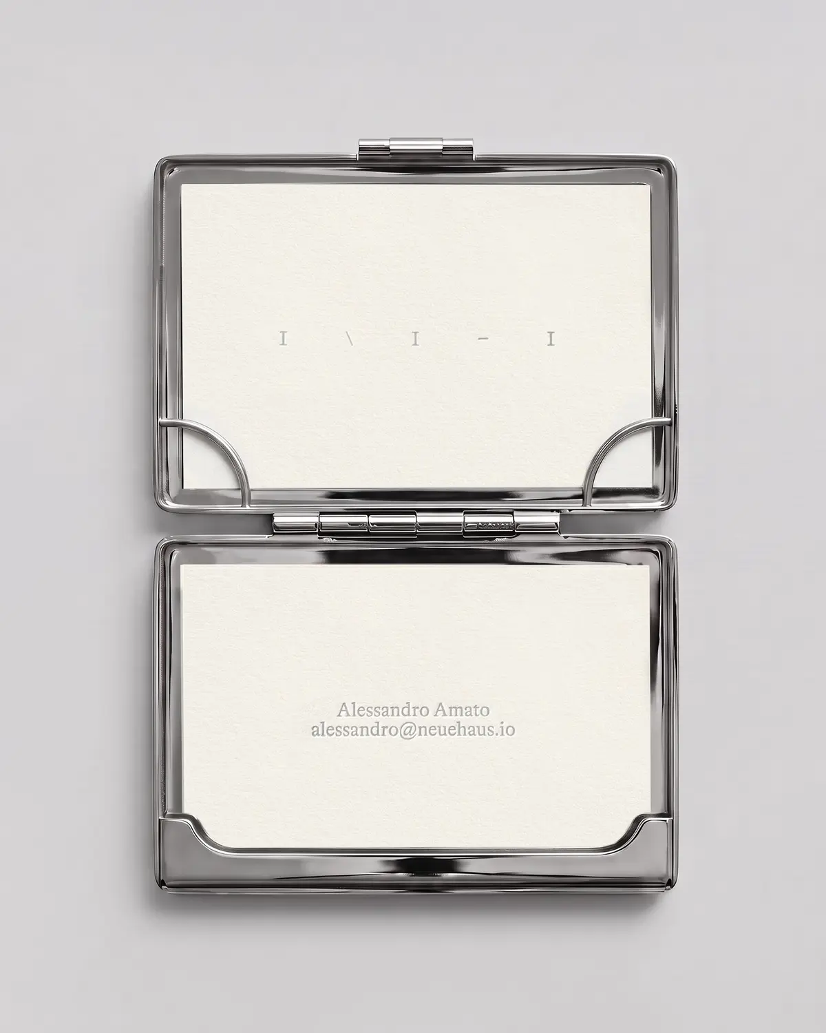
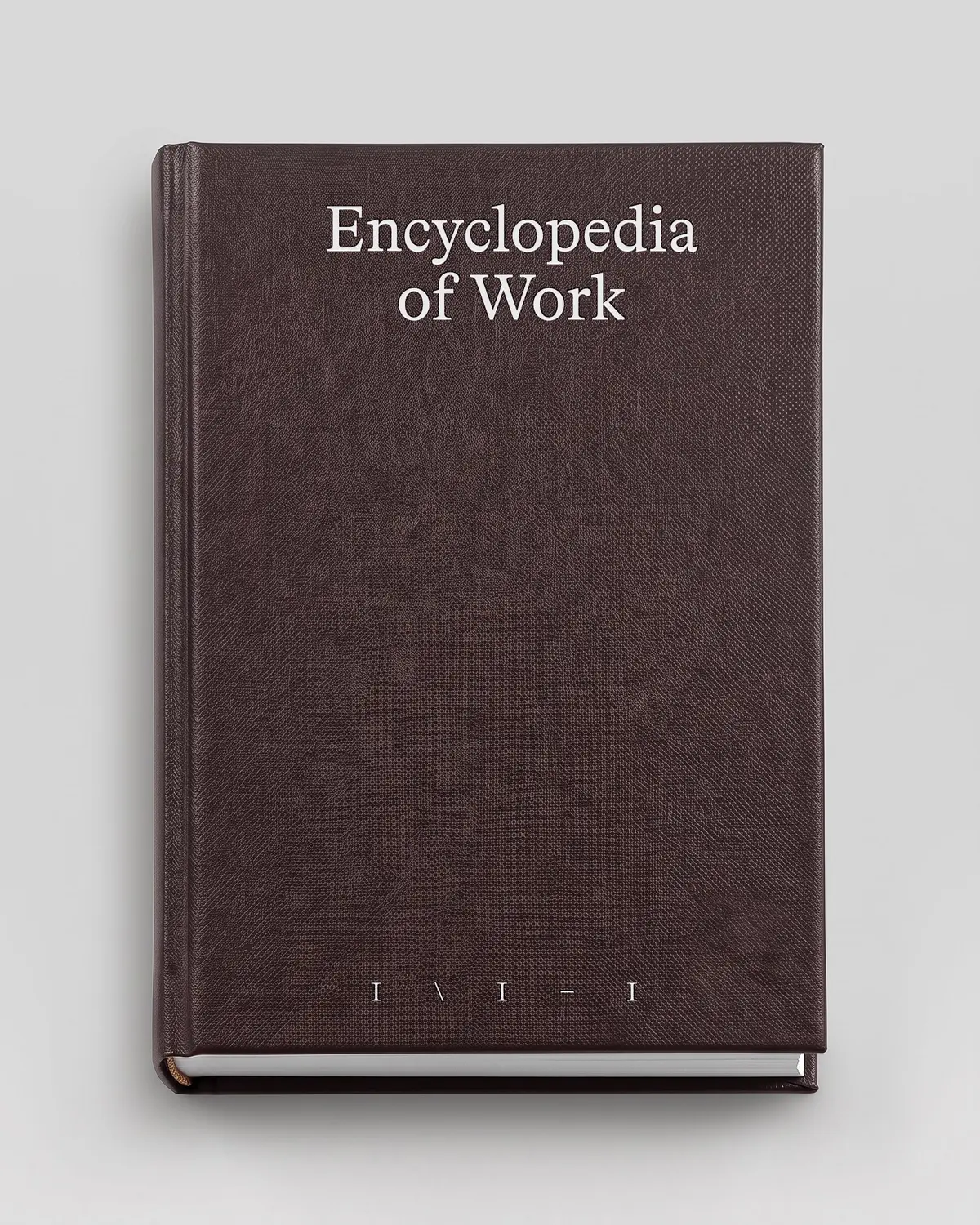
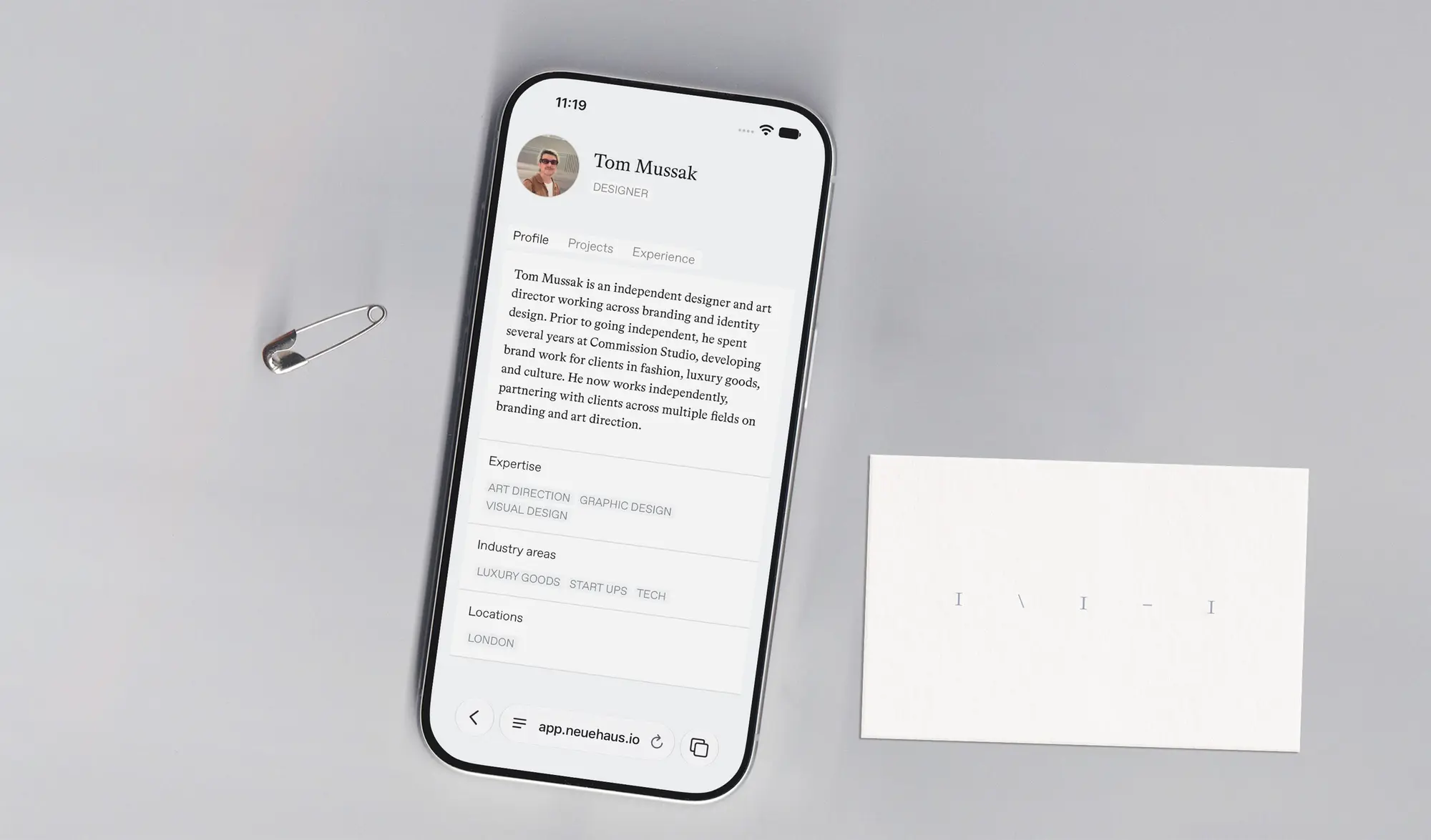
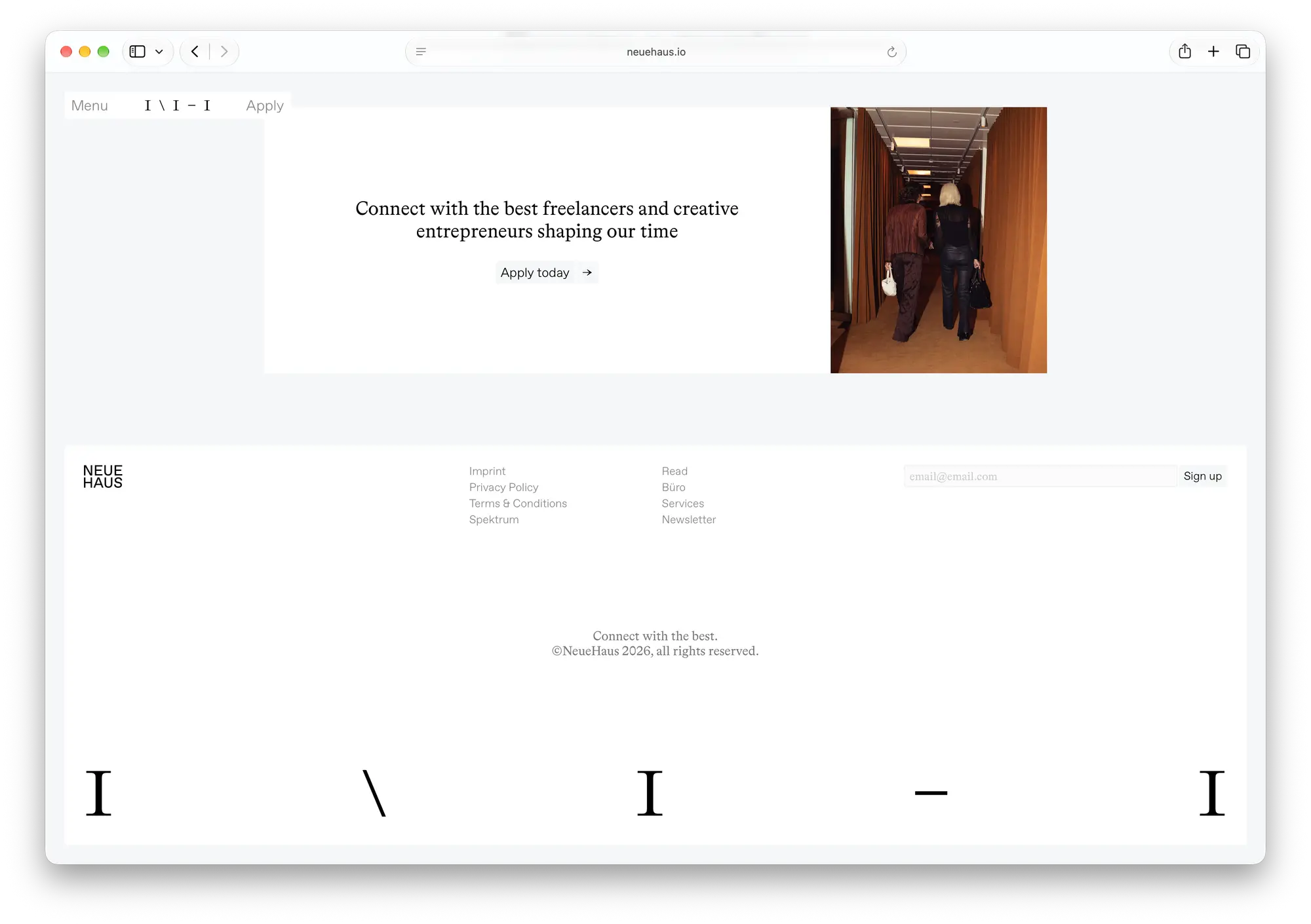
That's why we designed a new logo that isn't really a logo but more like a member code: Ⅰ\Ⅰ‒Ⅰ. It reads as NH in the Bradford typeface but it's entirely typed out. This means we don't need to share out PNG files and our members can easily use it to mark work or initiatives with NeueHaus by simply typing it out.
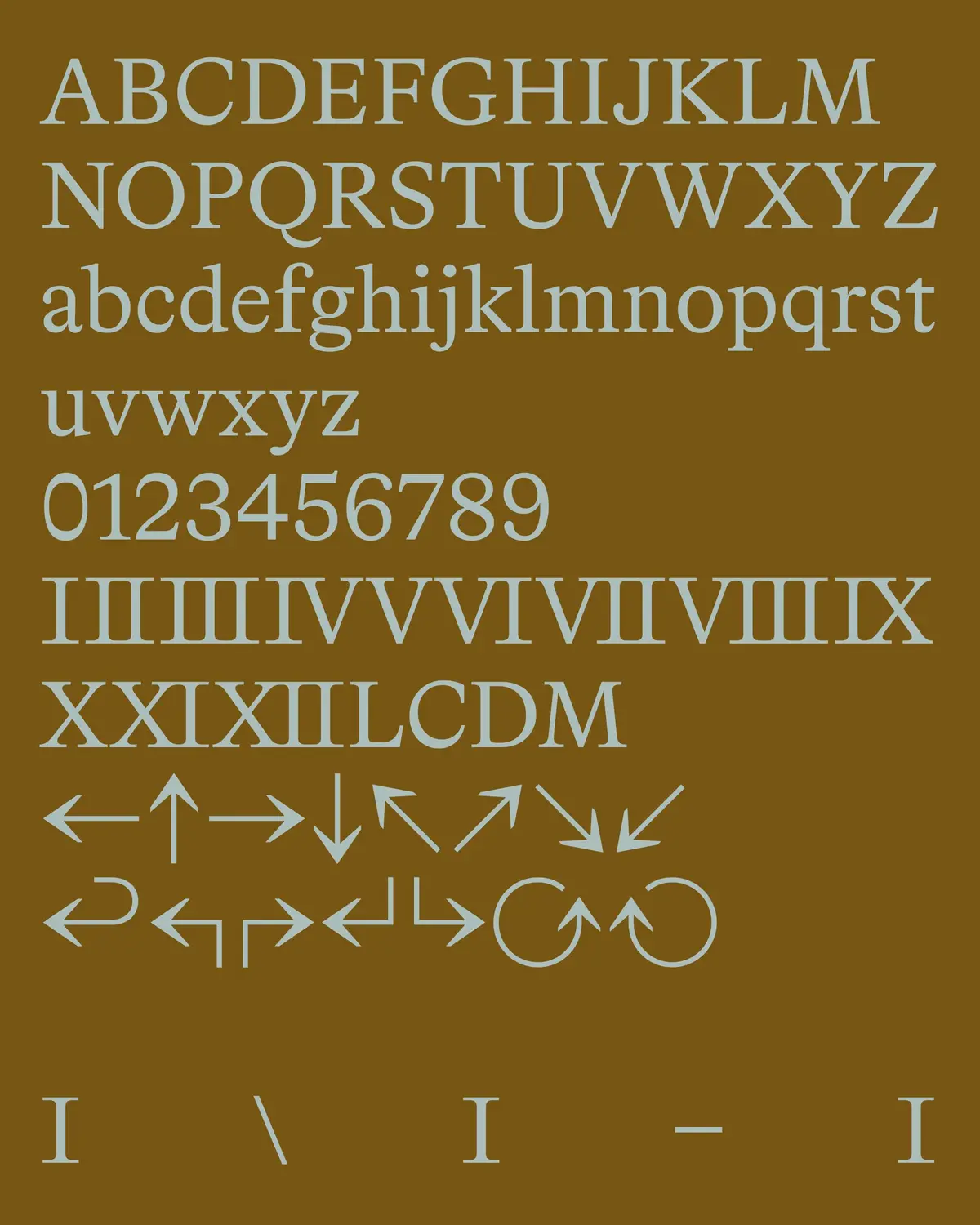
We landed on Bradford for this job because of its inherent authoritativeness. Its regular looks institutional like an encyclopedia, but its quirky glyphs and italics give it the crafty appeal that signals independence.
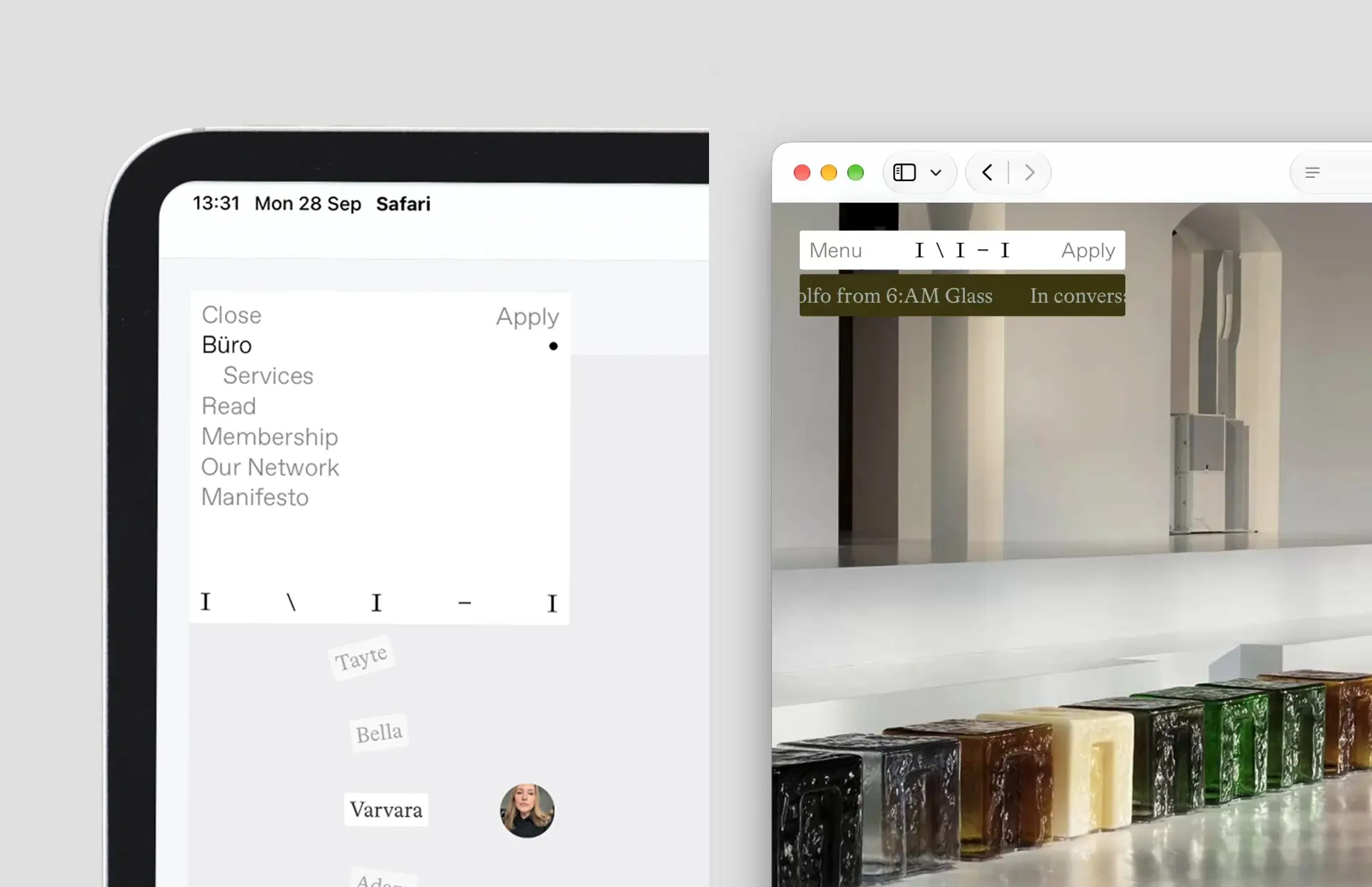
Complementary to this was creating a UI system that uses box layouts that resize depending on how much text they hold, and having a secondary typeface for more accessible UI elements such as buttons, inputs, member profile snippets, tags…
With such a broad range of disciplines and work styles, editorial and digital aesthetics to reconcile without being too imposing, motion helped us tremendously in giving everything a specific personality. Organic, gentle spring-based transitions, morphing boxes and subtle fades are what tie the website and app to our editorials and social content, and make it feel consistent.
Website as product
The most interesting part of building all of this together with our members in the Büro is that we developed the identity and engineered our products with the same care that we would do for a partner. Both our new site and Spektrum, our members' app, run on the same backend, built on Sanity and Supabase, syncing information about our members and our initiatives in both directions.
The website is a real piece of engineering, allowing our team to automate newsletter journeys, app and content workflows seamlessly.
Motion Studio
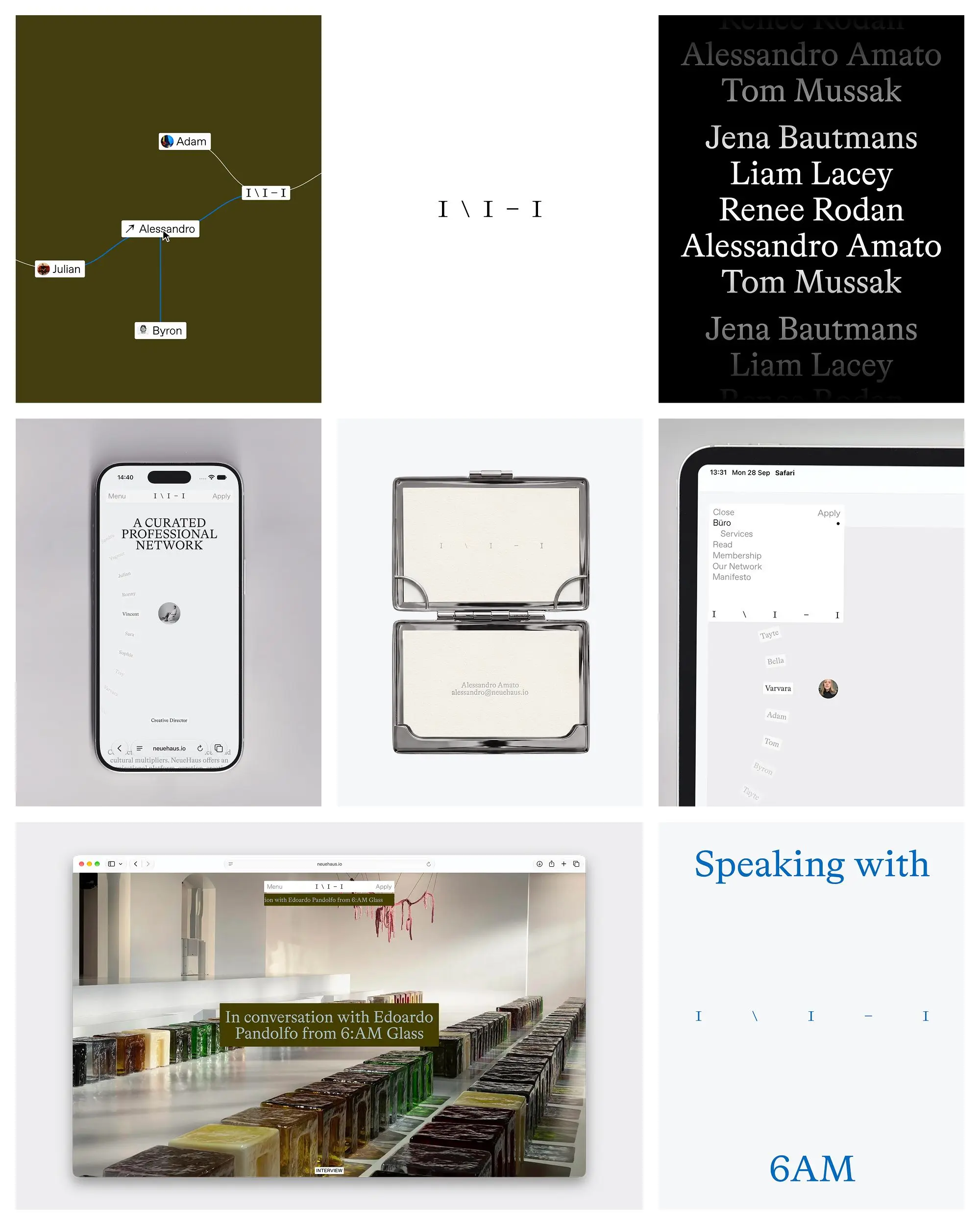
We built an entire motion studio inside our website that can export on-brand, ready-to-use video assets for social media.
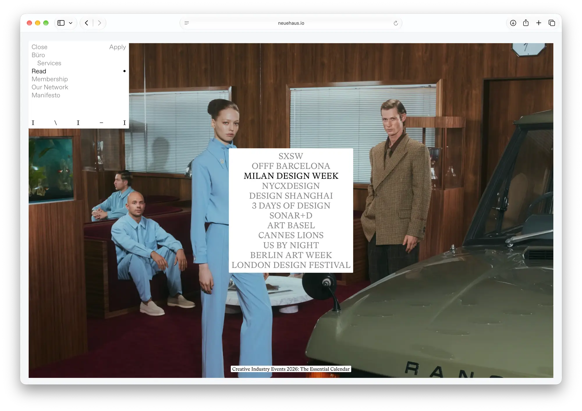
Motion Studio is a custom application that's part of our website CMS, and by now has around 50 different starter compositions. Many of these come from frames we designed ourselves and selected in Figma, built on our brand assets and new visual identity, and the rest are the live blocks of our website, the real components but with fully editable content from the studio dashboard. So our rolodex interaction, our hero blocks and our team network graph can play in the studio exactly as they do on neuehaus.io, and with a couple of clicks they can be exported as a 9:16, 4:5 or 16:9 mp4 for whatever platform.
The studio is built using the Sanity App SDK and runs inside our Sanity CMS dashboard, which means it sits right next to all of our content and only people in our organisation can operate it. A composition is a Sanity document like any other, and so is every image, film and export it produces.
Every easing and spring in our brand lives in one shared package which uses anime.js as a foundation and powers the motion studio, the website, our app, and anything else we will build.
The full article is The Brand Toolkit on NeueHaus Büro.
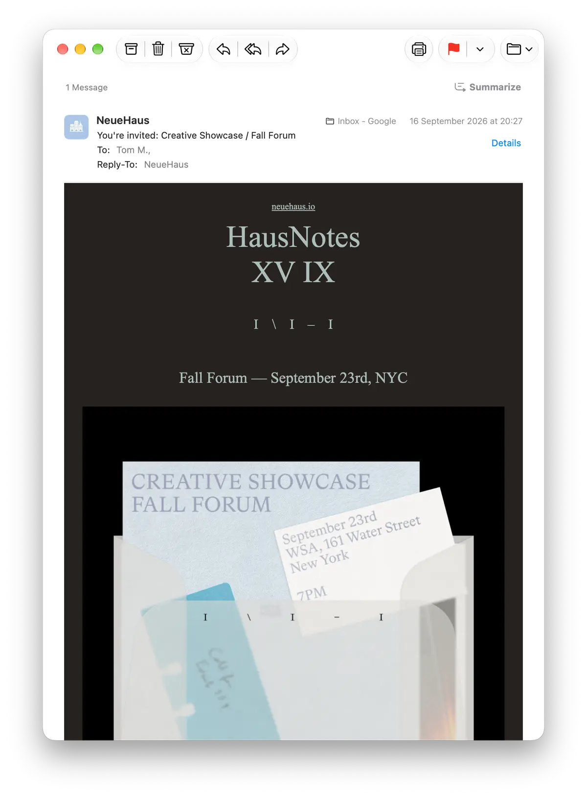
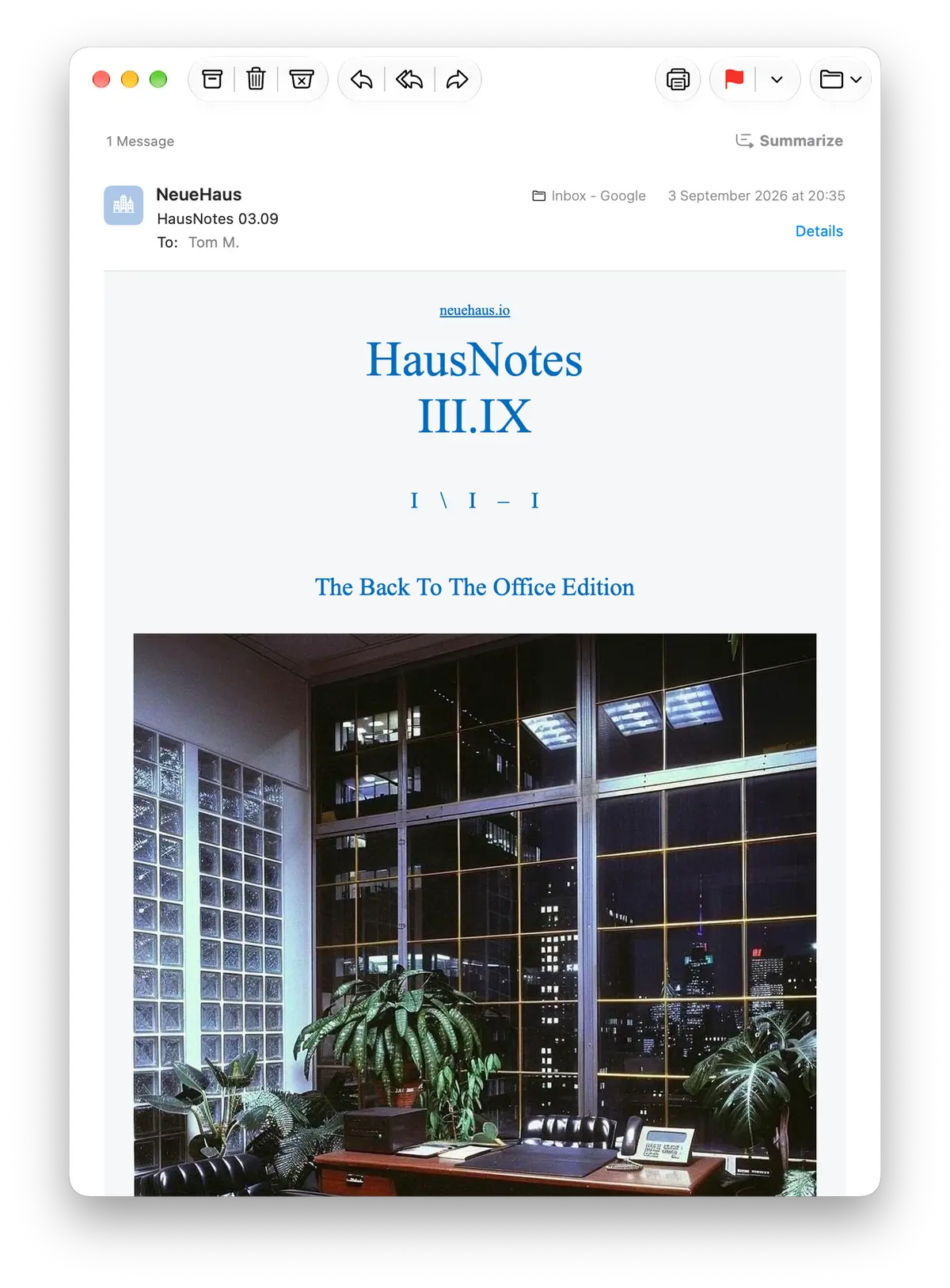
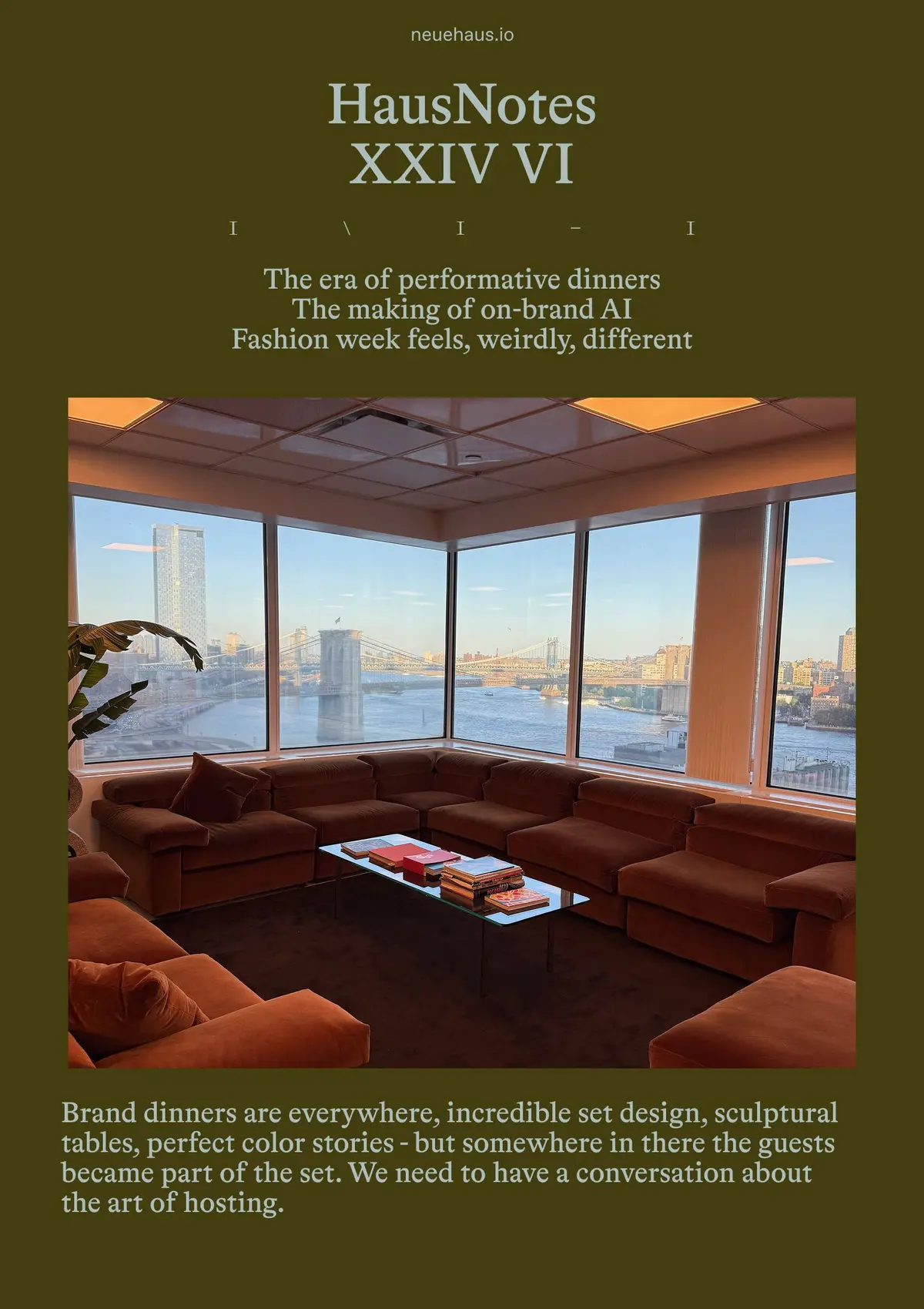
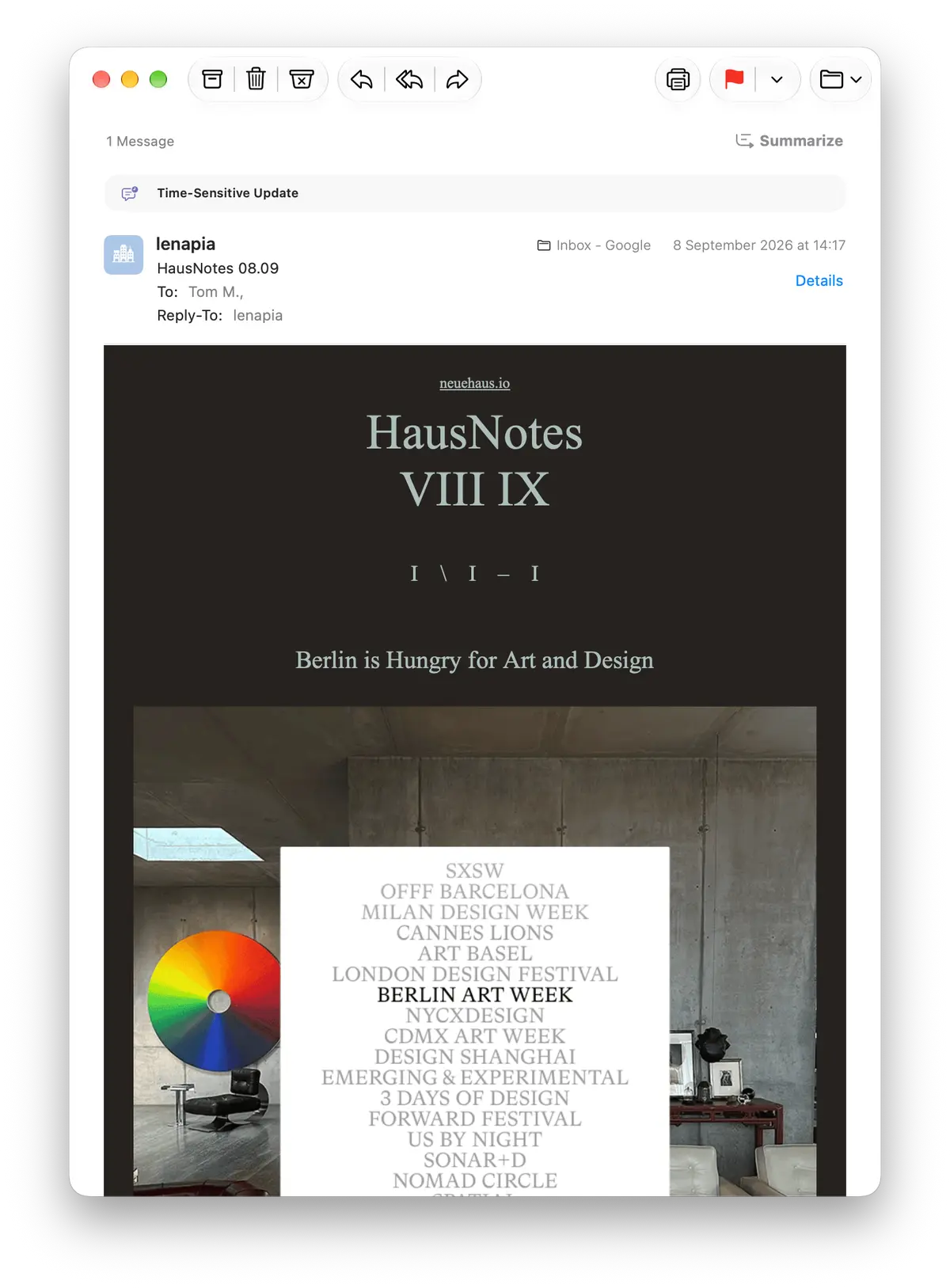
Typeface, colors and motion principles working together with NeueHaus' event photography and vintage office creative unlocked a rich brand system that extends far beyond our website, into our app, social content, newsletter, event creative, merchandise and memorabilia concepts. More importantly, it allows the heterogenous work and imagination of our members to shine.
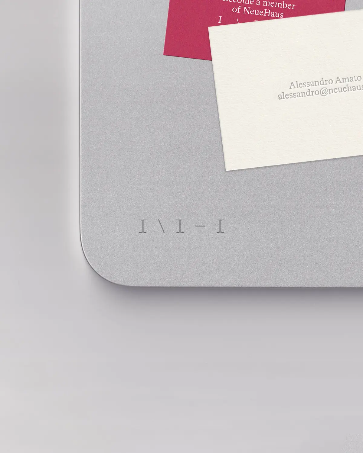
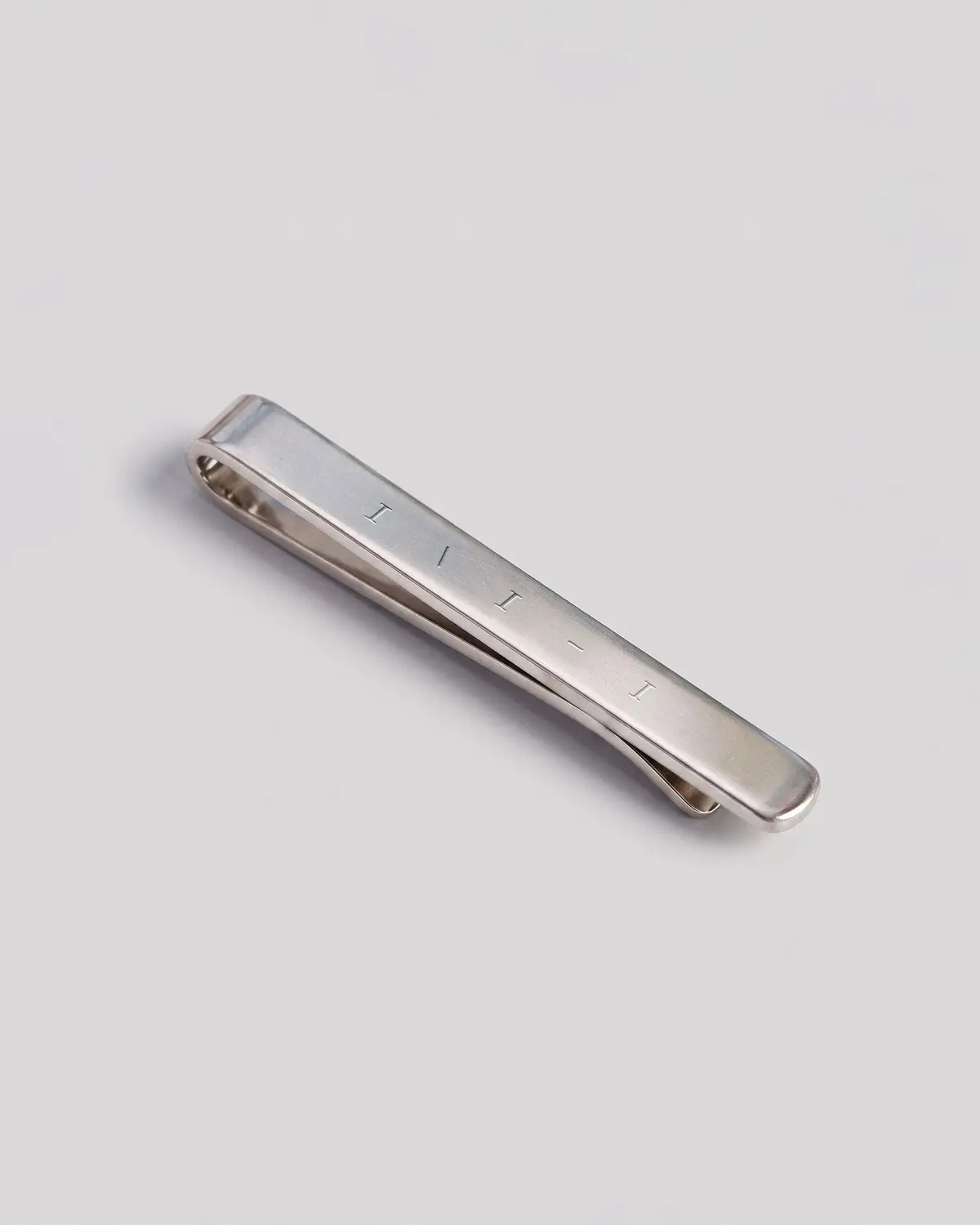
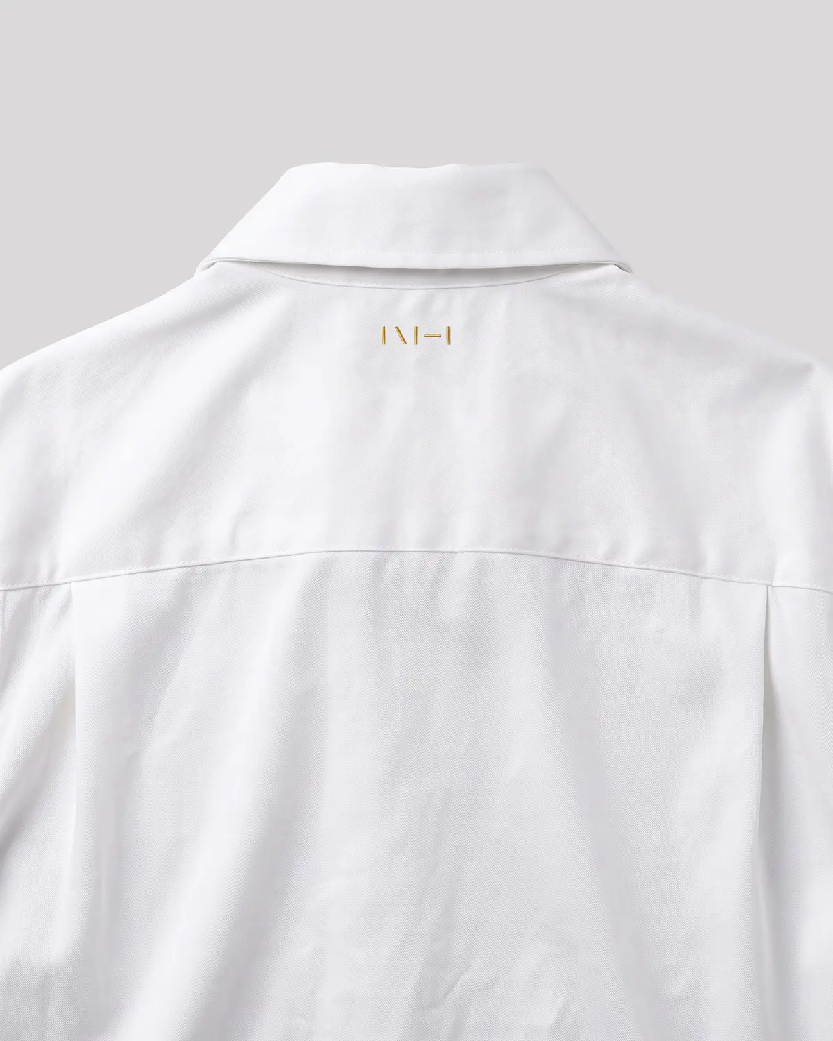
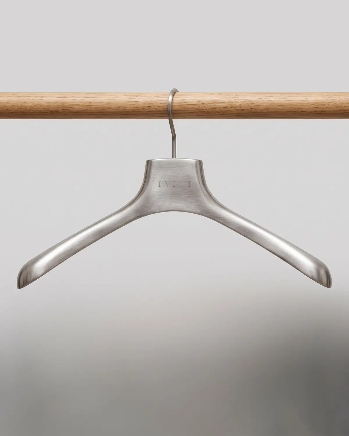
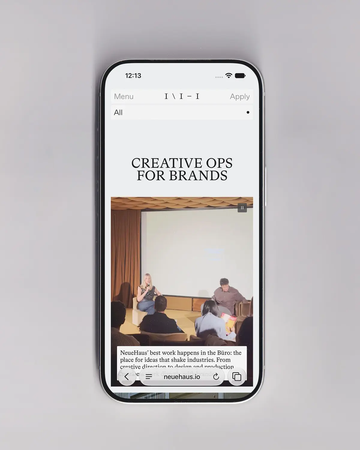
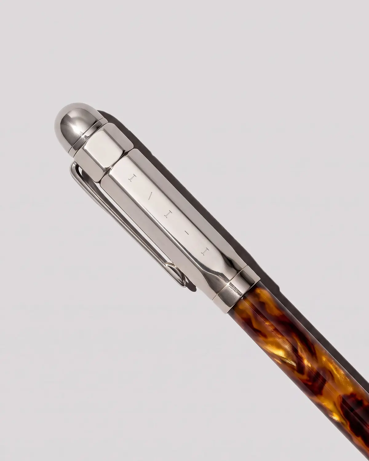
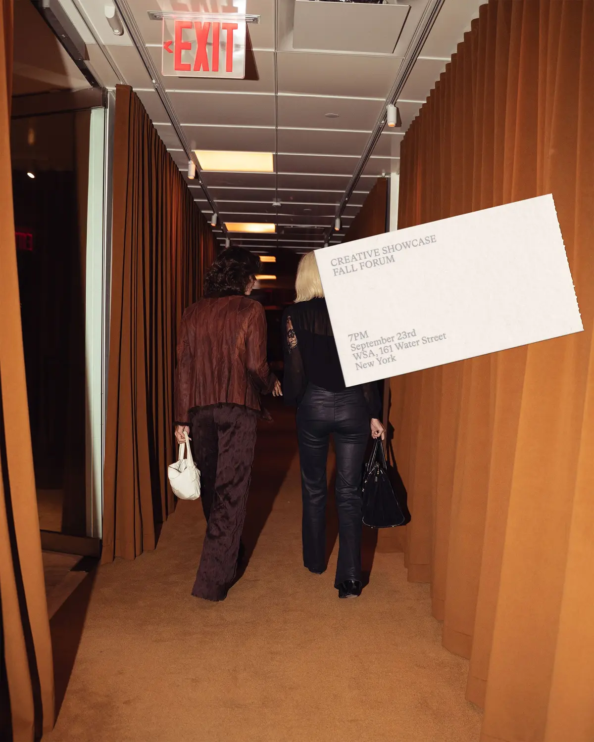
A fluid brand system for a contemporary guild of creative professionals. We believe this new chapter of NeueHaus will encourage our members and creatives at large to focus on what deserves our attention, to create meaningfully, and to curate.
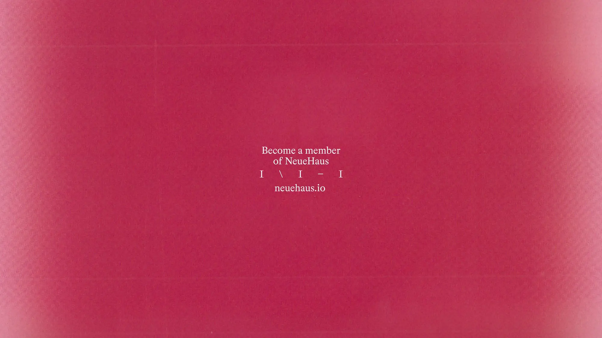
Creative Direction, Strategy, Content: Lena Pia. Creative Direction, Design & Development: Alessandro. Art Direction, Brand & Design: Tom Mussak.